Stotles
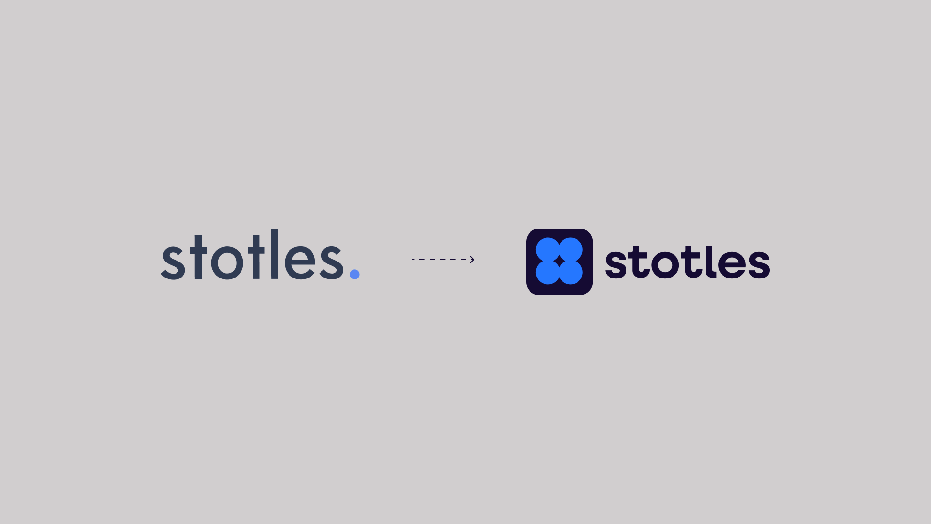
New Look and New Brand Positioning
_
Since launching in 2019, stotles has been on a mission to simplify how businesses engage with the public sector. What began as a six-person startup has grown into a 60-strong team powering one of the UK’s leading procurement intelligence platforms.
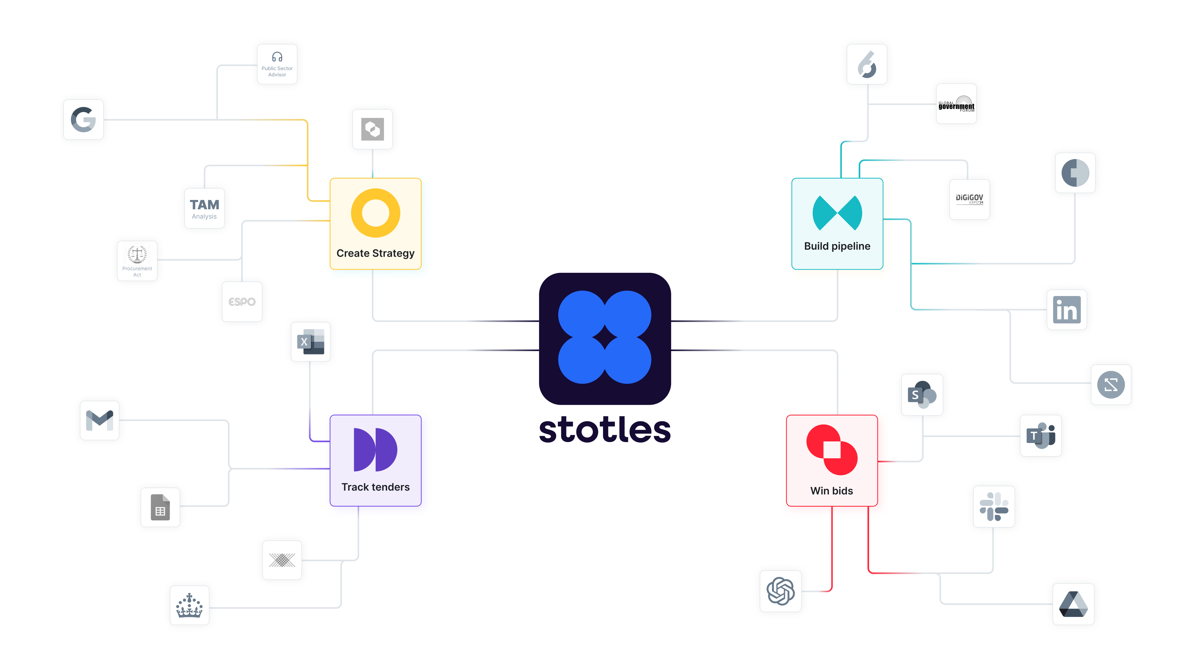
With a bold vision to become the go-to application for identifying, qualifying, nurturing, and building public sector pipelines—faster, smarter, and more collaboratively—stotles needed a brand identity that could keep pace with its ambition.
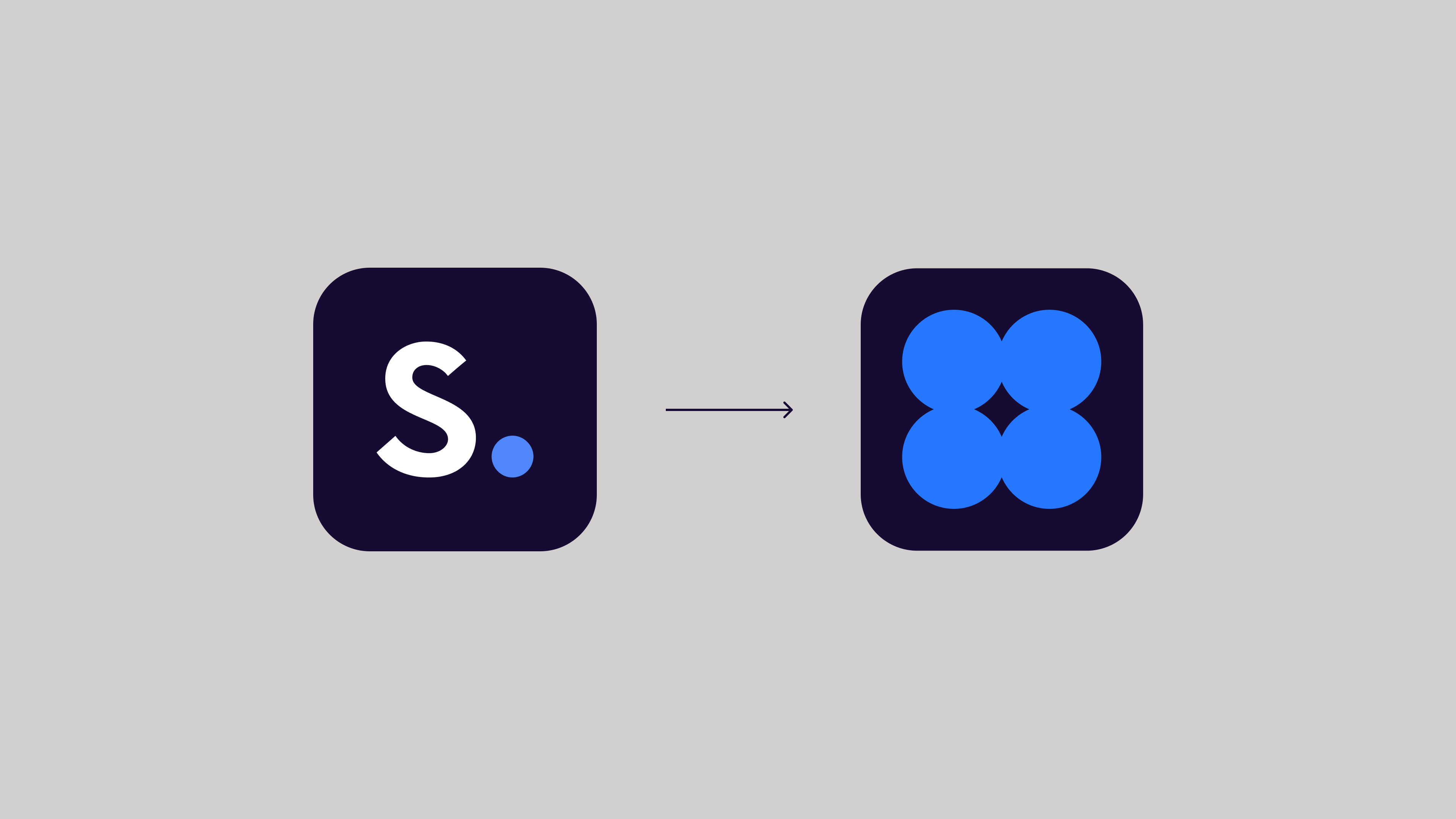
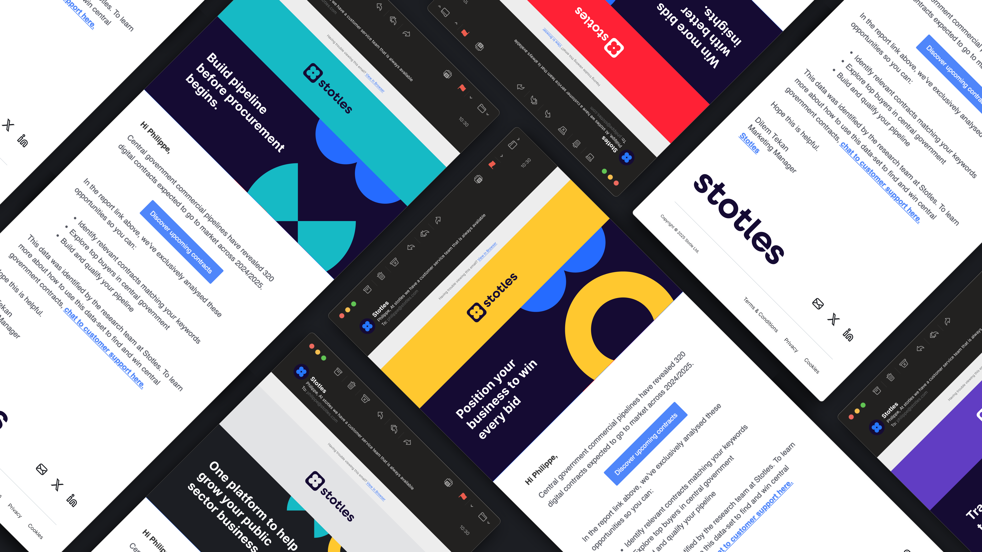
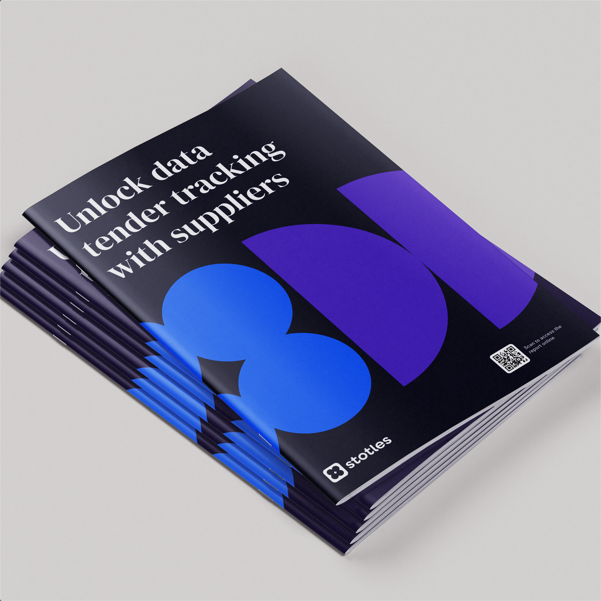
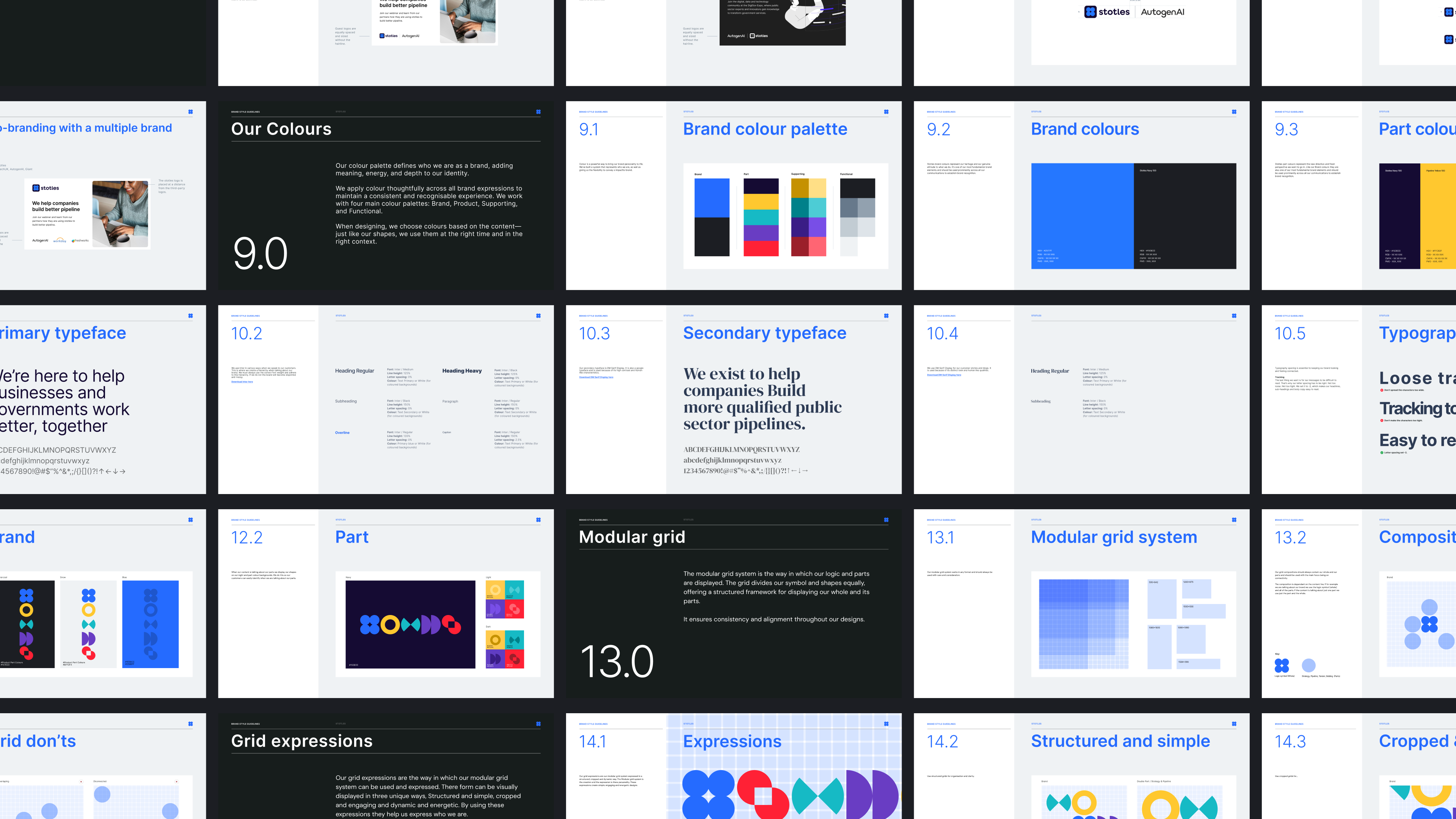
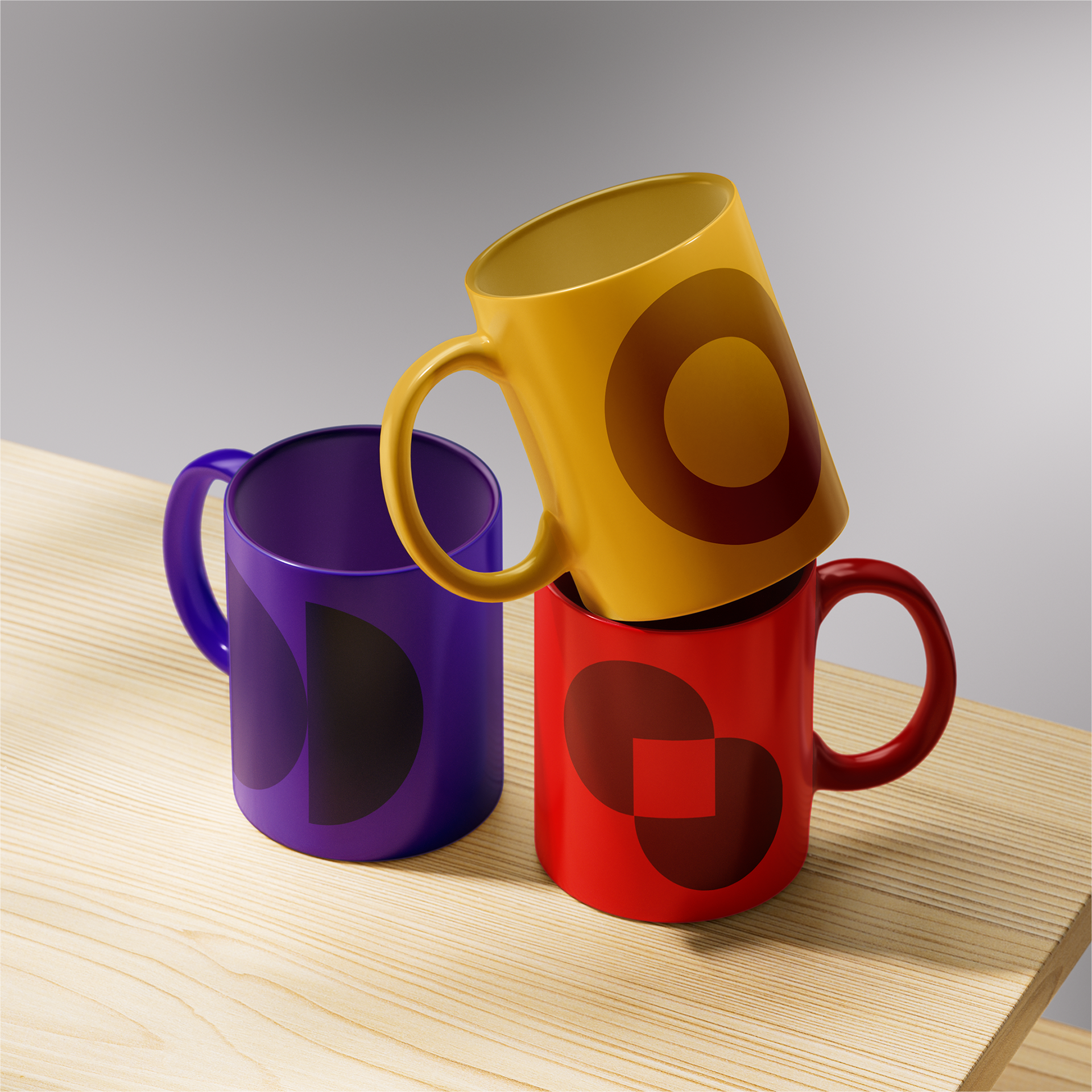
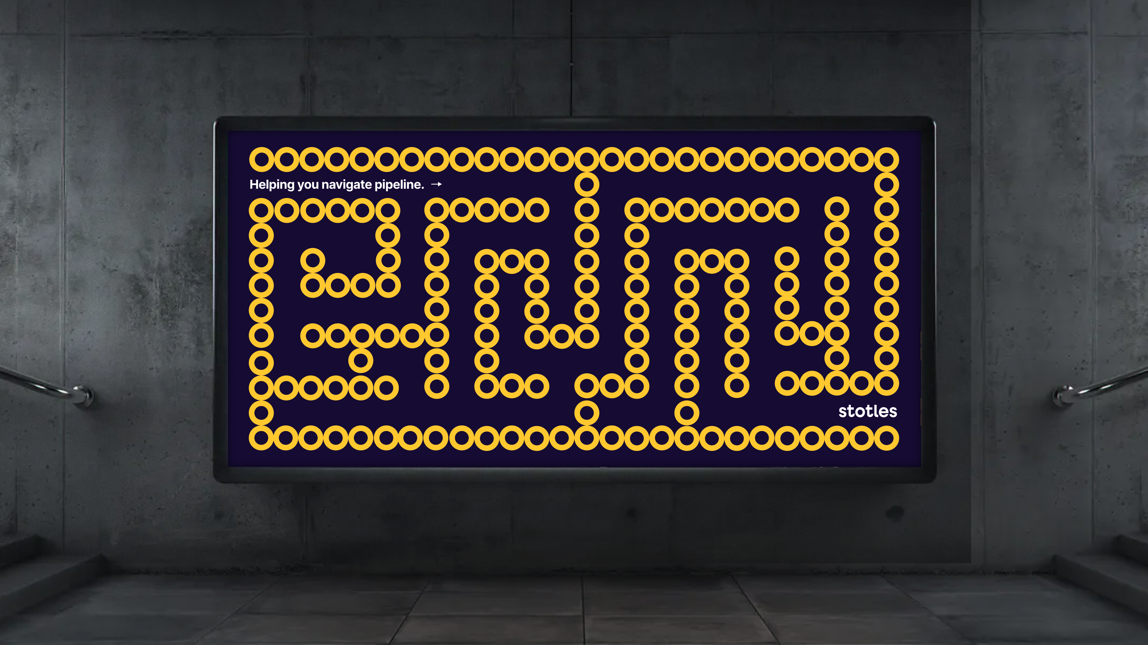
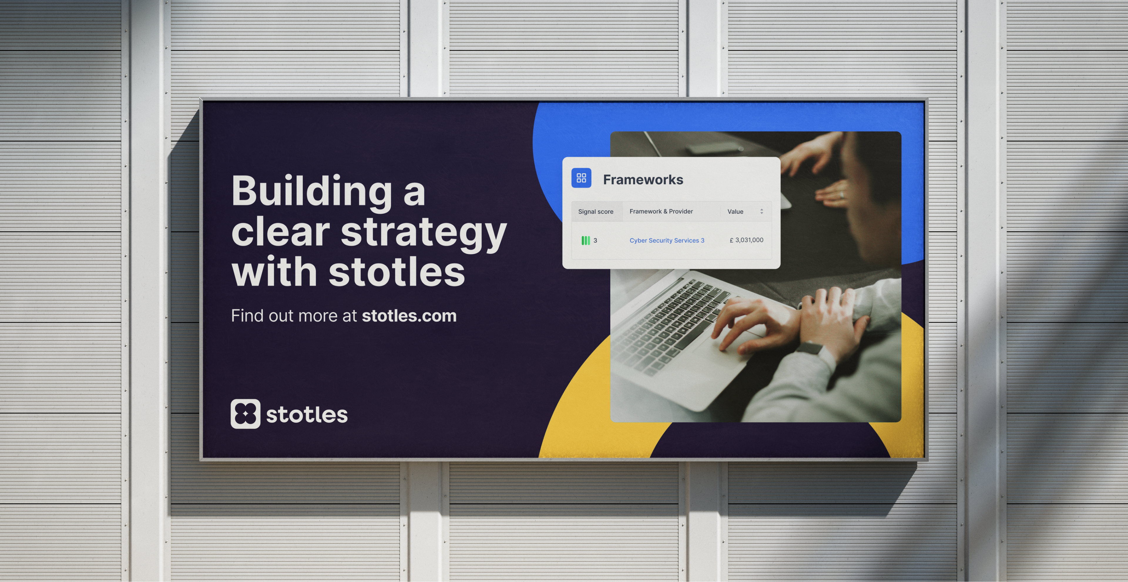
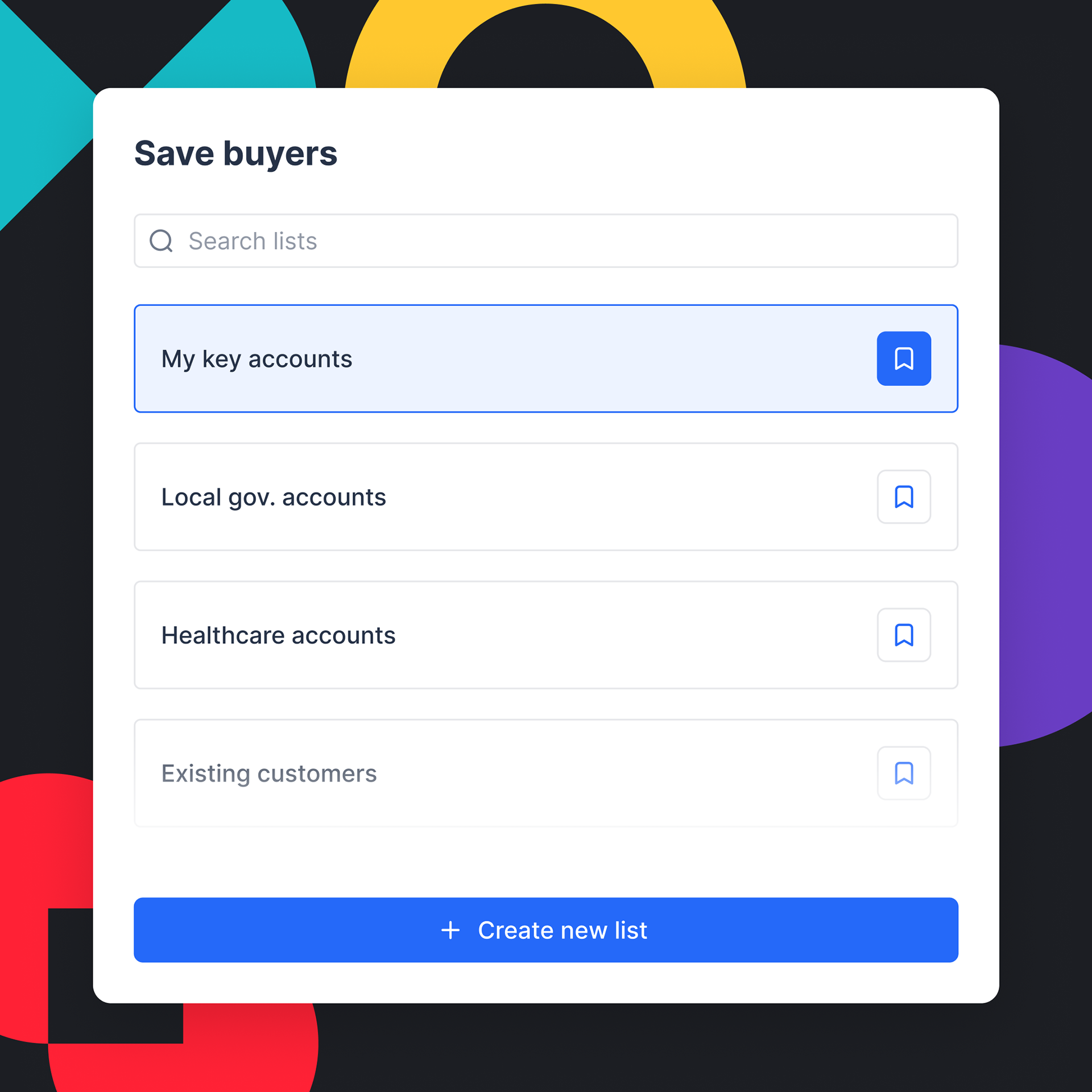
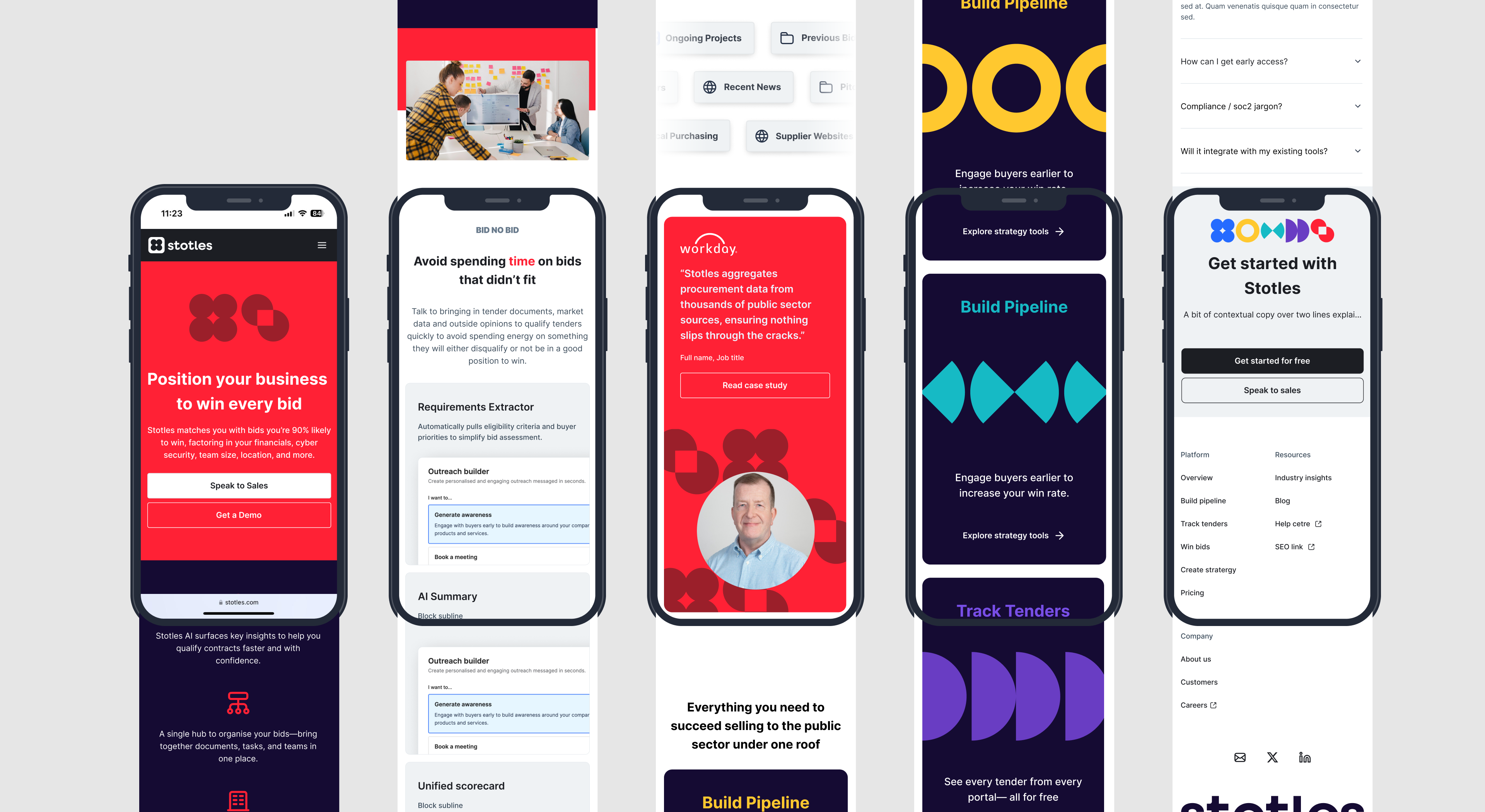
I developed a brand system rooted in clarity, agility, and unity. Taking inspiration from Stotles’ core principle “the whole is greater than the sum of its parts,” I helped shape a visual and strategic identity that reflects their modular, data-driven approach to procurement.
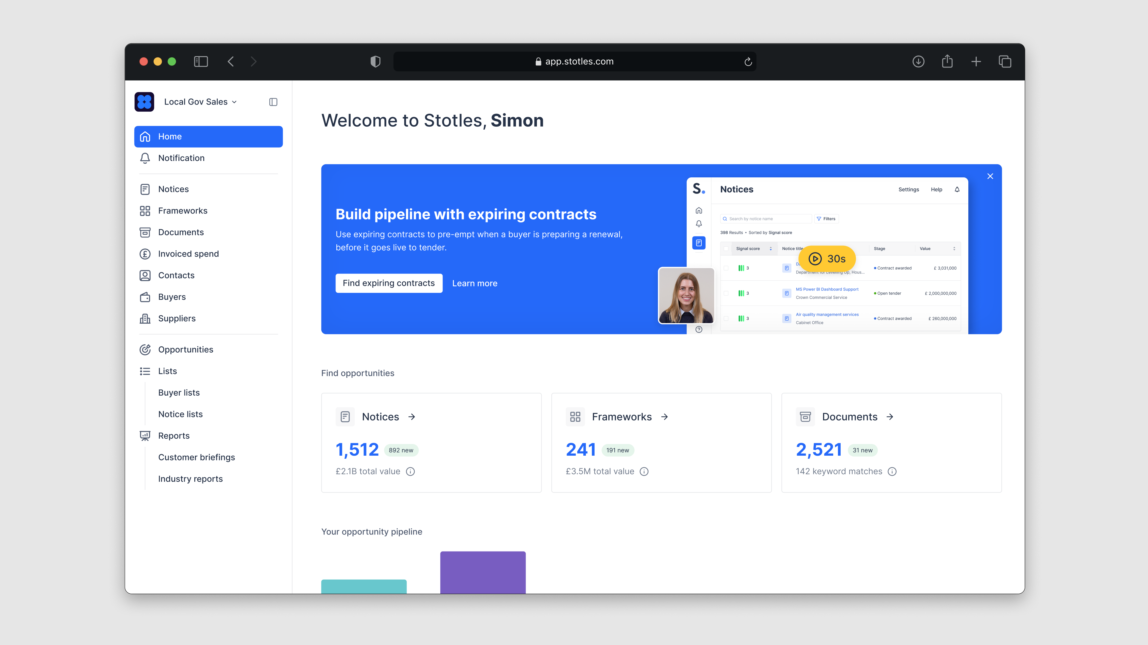
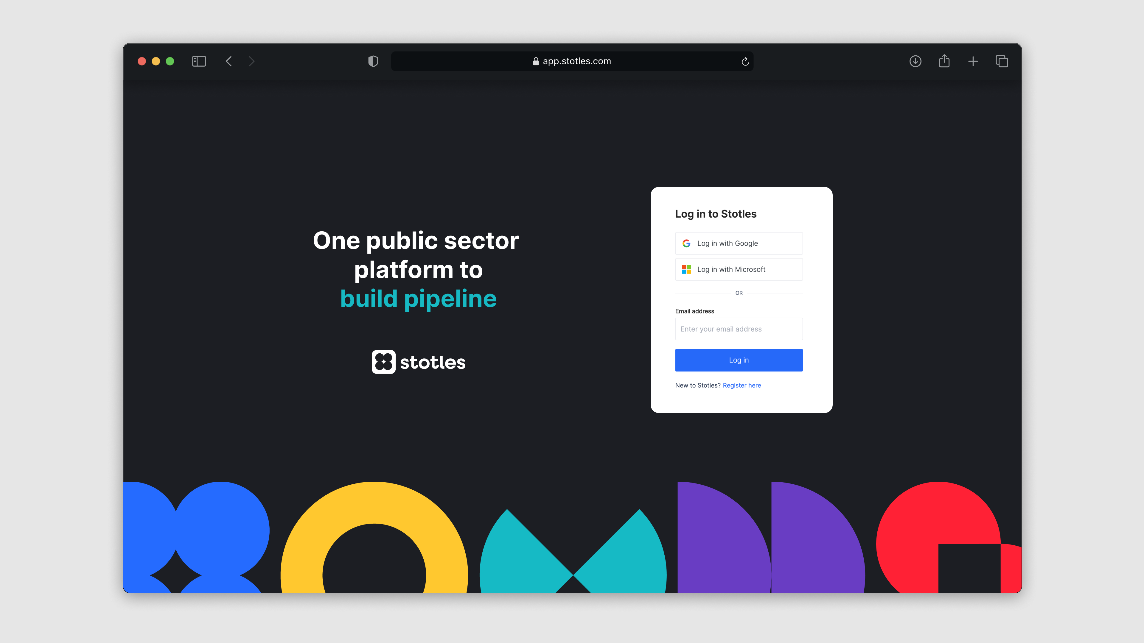
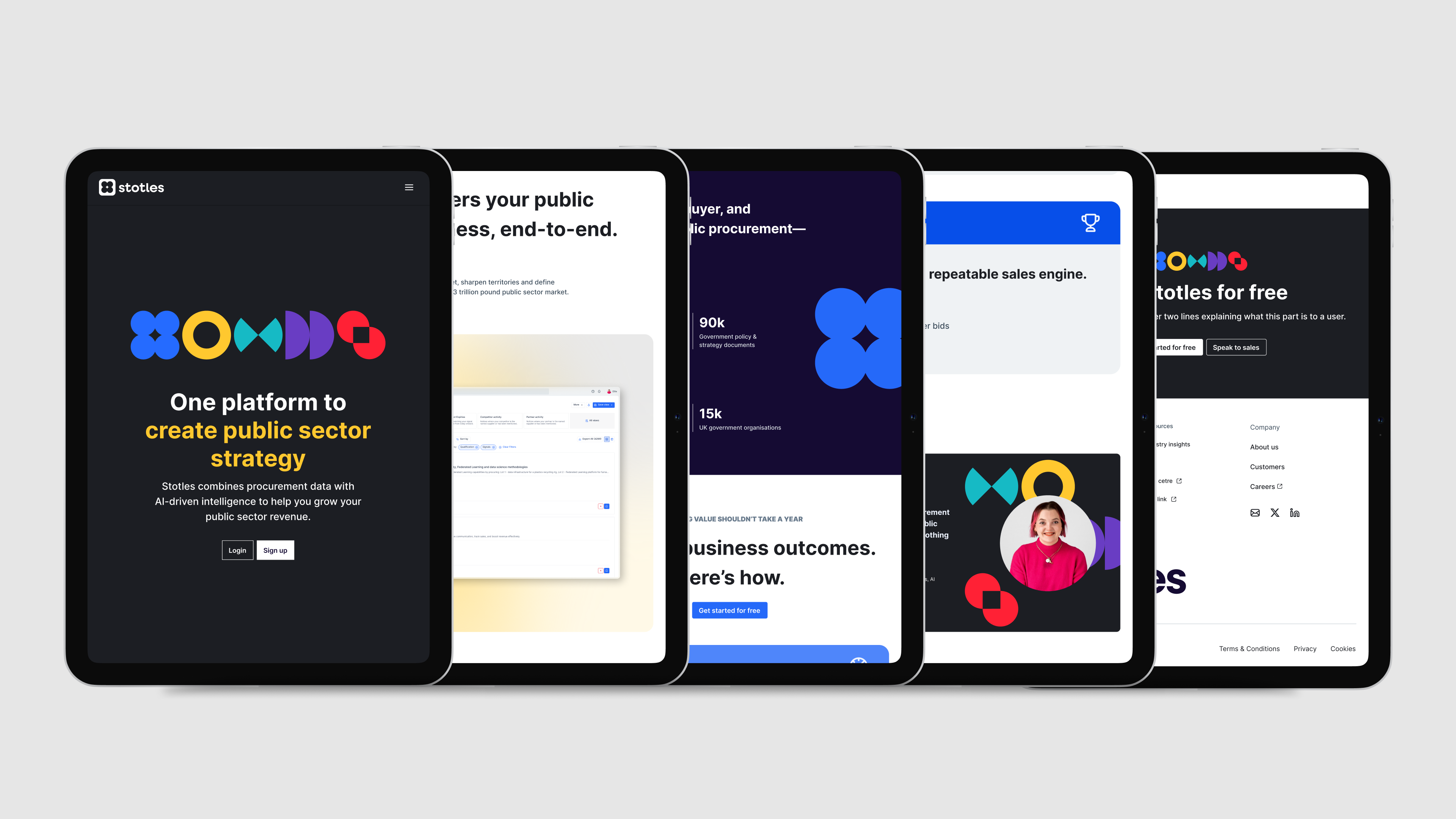
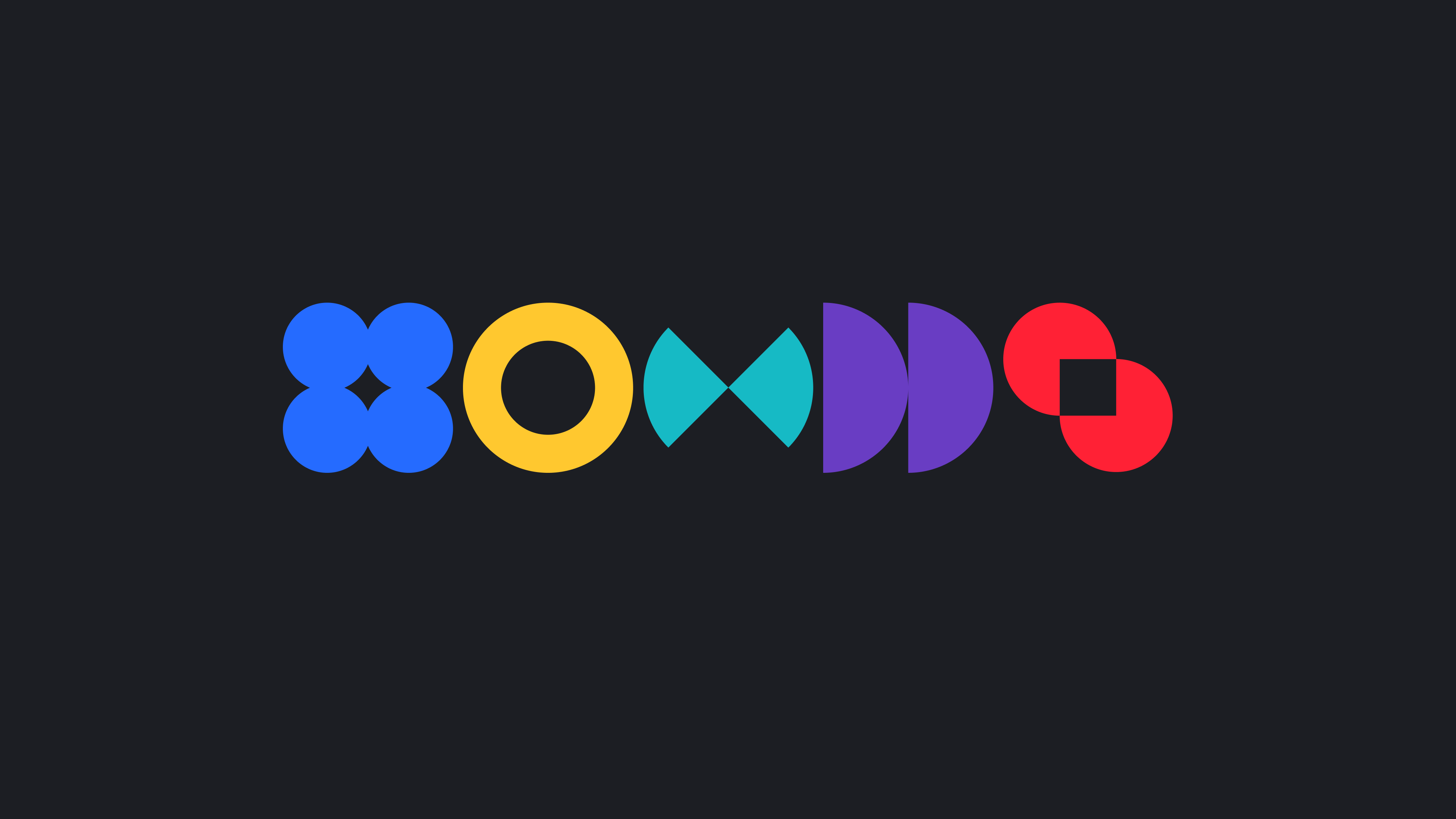
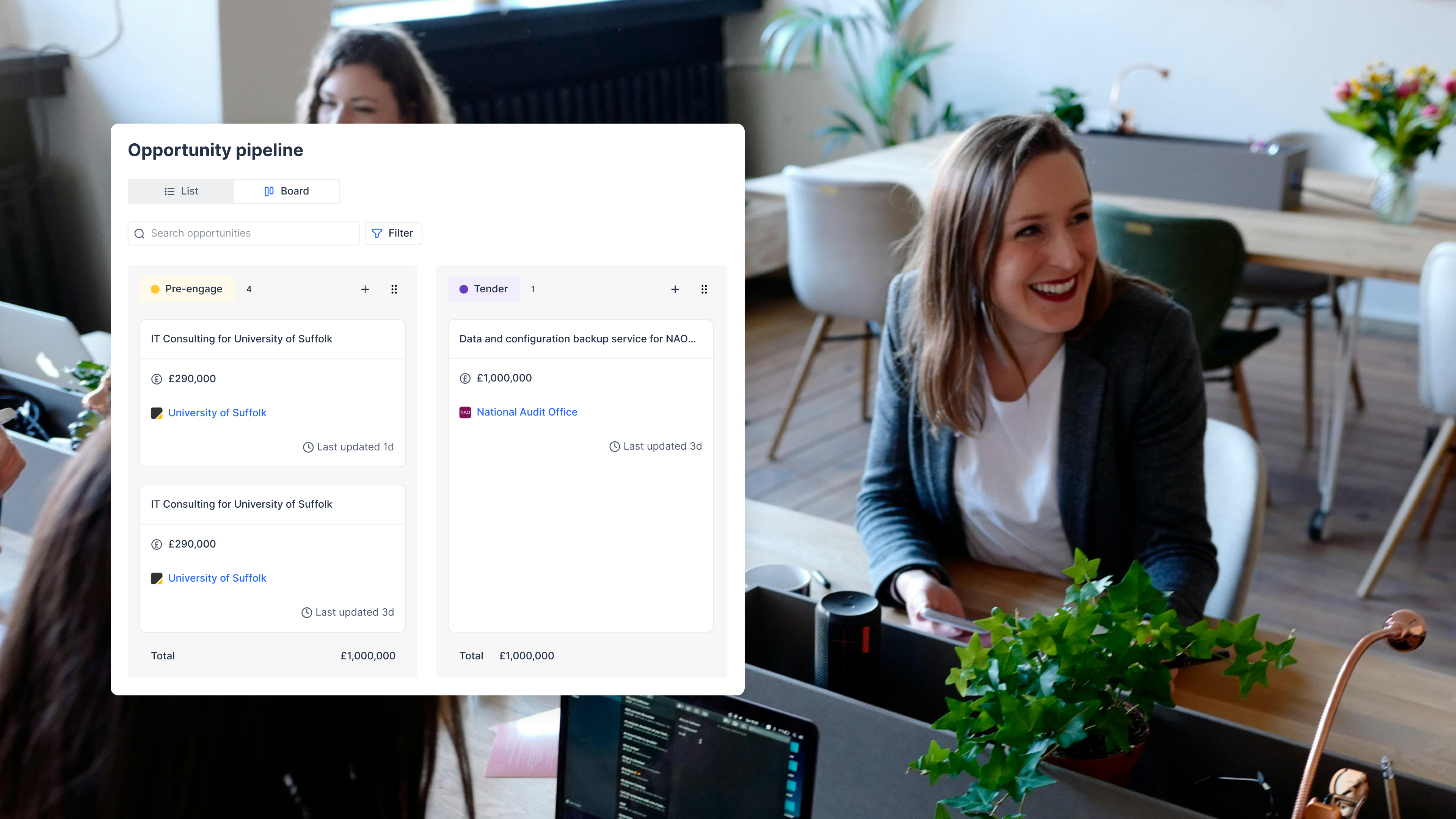
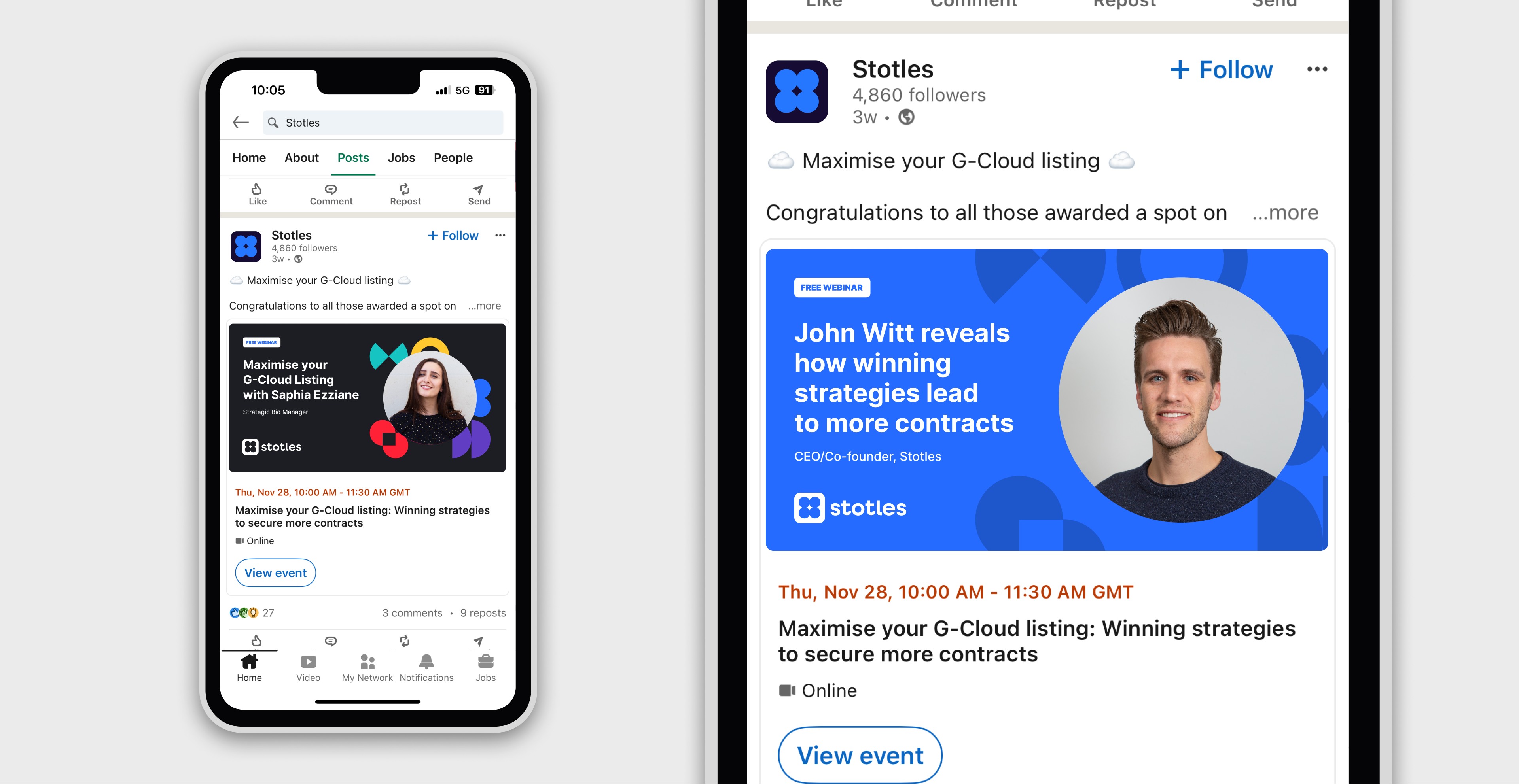
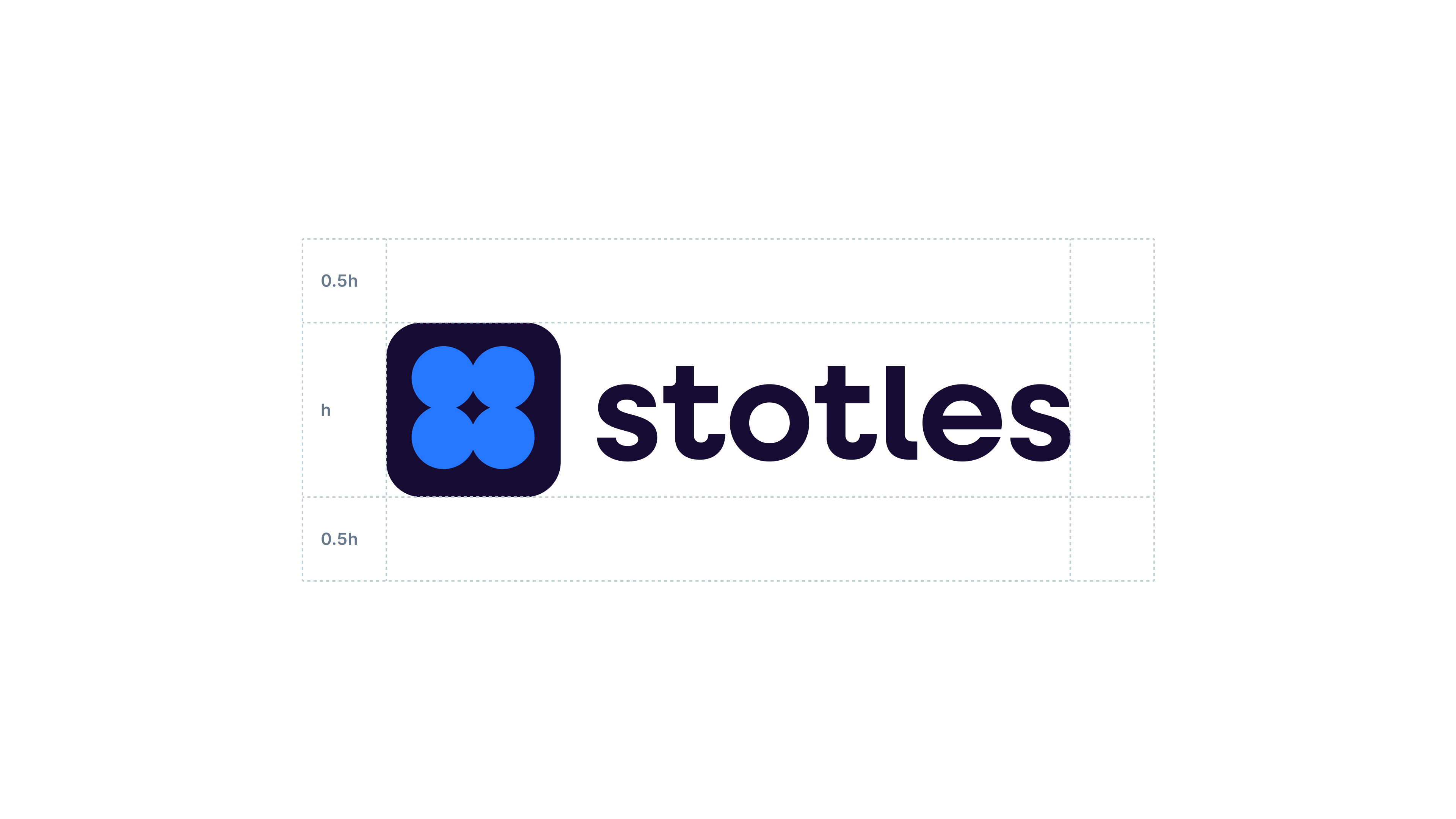
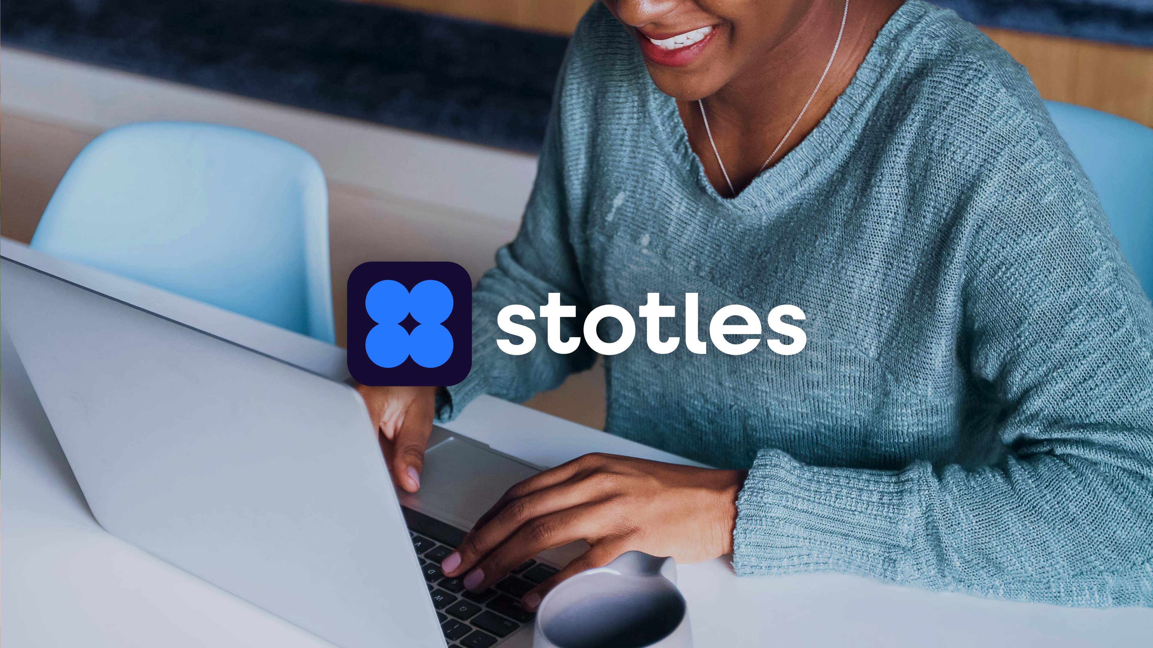
From tone of voice to digital UI cues, the brand was designed to flex seamlessly across platforms, balancing the trust and authority required in public sector work with the momentum of a fast scaling tech company. At the heart of the identity sits the Logic Logo, a dynamic geometric mark that symbolises interconnected intelligence, the very core of what Stotles offers.
The result? A design system built not just to look good, but to scale with purpose, positioning stotles as the trusted digital partner for public sector pipeline growth.
_
Role: Creative Direction, Brand Positioning and Visual Design
Team: Simon Toy, Philippe Ziya and Stotles Brand Studio
Team: Simon Toy, Philippe Ziya and Stotles Brand Studio